Most people choose their kitchen cabinet color first, then pick a countertop that “goes with it.” This sounds logical. In practice, it’s one of the main reasons kitchens end up looking slightly off — not bad enough to pinpoint the problem, just not quite right.
The issue is that cabinets and countertops don’t exist in isolation. They sit next to each other, all day, under whatever light your kitchen has. What looks like a good match in a showroom — where the lighting is controlled and the samples are small — can look like a near-miss when both surfaces are installed at full scale in your actual home.
This guide gives you a framework for making this decision that actually works, based on what the surfaces do visually rather than what they look like on a sample card.
Start With Contrast, Not Color
The most common mistake in cabinet-countertop pairing is trying to match colors. Two surfaces that are close but not identical in color look like an error — like you tried to match and didn’t quite get there. Two surfaces with deliberate contrast look like a decision.
The question to ask first is not “what color is my countertop?” but “how much contrast do I want between my cabinets and my countertop?” Your answer to that question narrows the field considerably.
High contrast means one surface is significantly darker or lighter than the other. White cabinets with dark grey countertop. Navy lower cabinets with white marble countertop. Dark walnut-look cabinets with light quartz. High contrast creates visual energy, makes the kitchen feel dynamic, and tends to look good in larger spaces where the eye has room to move between the two.
Low contrast means the surfaces are in the same tonal family — both light, both warm, both neutral. Warm white cabinets with cream quartz. Light oak with beige stone. Greige cabinets with taupe countertop. Low contrast creates calm, cohesion, and a sense of the kitchen as one unified space rather than two competing surfaces. It works especially well in smaller kitchens where high contrast can feel busy.
Matching (same color, same finish): Usually avoid. Unless both surfaces are identical in material and clearly intentional, surfaces that are close but not identical look like a mistake rather than a choice.
Once you’ve decided on your contrast level, the specific color choices become easier because you’re working within a defined range rather than trying to hit an exact target.
White and Light Grey Cabinets: The Most Forgiving Base
White and light grey cabinets pair well with almost everything, which is part of why they’ve dominated kitchens for the past decade. The catch is “almost” — there are still ways to get this wrong.
White cabinets with white countertop: Works only if both surfaces are genuinely the same white. Warm white cabinets with cool white quartz will clash because one reads cream and the other reads blue-grey. If you’re going all-white, either use the same material for both or ensure both surfaces have identical undertones. When in doubt, go to warm — a slightly warm white countertop against slightly warm white cabinets reads as intentional. A warm white cabinet against a stark cool white countertop reads as a mismatch.
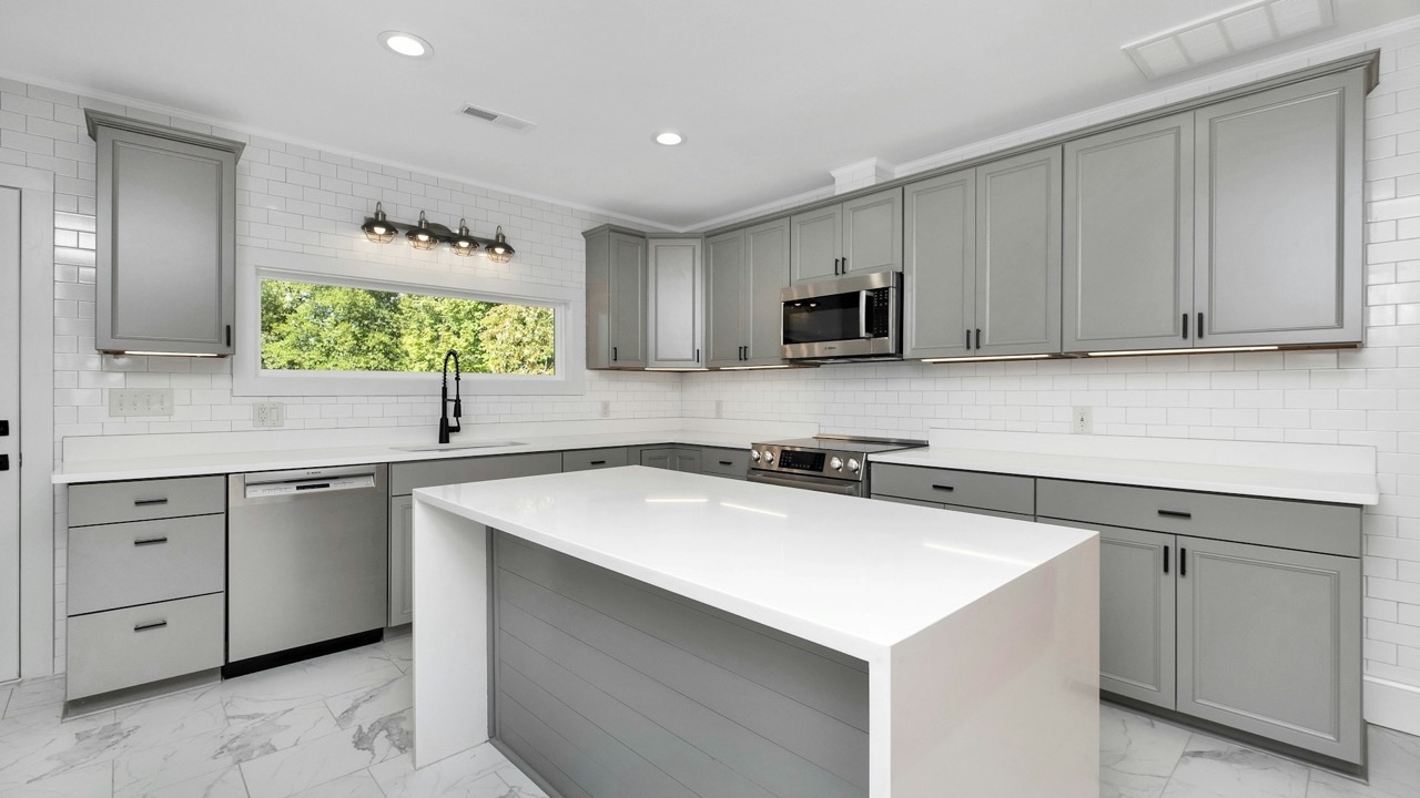
White cabinets with dark countertop: A classic combination for a reason. The contrast is high and clean, the kitchen reads as fresh and deliberate, and the dark countertop grounds what would otherwise be a very light space. Black granite, dark grey quartz, and charcoal soapstone all work here. The one thing to avoid: a dark countertop with visible dark veining against very stark white cabinets can feel heavy. Adding a mid-tone backsplash between them — grey tile, soft marble mosaic — bridges the gap visually.
White cabinets with wood-look or natural wood countertop: Increasingly popular and genuinely warm. The wood breaks up what can be a clinical all-white kitchen and adds material interest without color risk. Butcher block, light oak veneer countertops, or bamboo surfaces all work well here. Keep the wood on the lighter end — dark wood against white can tip into high contrast in a way that makes the white feel cold rather than clean.
Light grey cabinets: Follow the same logic as white but with slightly more flexibility. Light grey has enough color to pair with warmer surfaces (veined marble, warm quartz) without clashing, whereas stark white cabinets can sometimes fight with warm-toned countertops. Light grey is also more forgiving of near-misses in white-on-white situations because the color difference is clear and intentional.
Wood and Warm-Toned Cabinets: The Surface That Needs a Counterpoint
Wood-look cabinets — whether solid wood veneer, PVC film with a wood grain print, or a painted finish in warm beige or tan — are having a significant moment in 2026 kitchens. The challenge is that warm surfaces need something to counterpoint them or the kitchen feels monolithic.
Wood cabinets with white or light quartz countertop: The most successful combination. The cool, smooth countertop surface provides contrast to the warmth and texture of the wood, and the combination feels grounded and contemporary. This is the pairing that most kitchen designers reach for when the brief is “warm but modern.” Light maple or oak with white quartz is a specific combination that appears in a huge percentage of 2026 kitchen renovations for exactly this reason.
Wood cabinets with marble or marble-look countertop: Works when the marble is light and the veining is warm-toned (cream Calacatta, warm Arabescato) rather than cool-veined (stark white with grey-blue veining). Cool-veined marble against warm wood creates a tension that can look intentional or can look like two materials fighting — the difference is usually in the undertones matching.
Wood cabinets with dark countertop: Requires care. Dark countertop against wood cabinets can make the kitchen feel heavy because both surfaces have visual weight. If you want this combination, use it in a kitchen with strong natural light and keep upper cabinets lighter than lower cabinets — the light upper cabinet softens the effect considerably.
Wood cabinets with wood countertop: Usually avoid. Two different wood tones will clash, and two matching wood tones will look monotonous. The one exception is a deliberate contrast between a very light wood cabinet and a very dark wood countertop (or vice versa), where the difference is unmistakably intentional.
Dark Cabinets: The Combination That Most People Get Wrong
Navy, deep green, charcoal, dark grey, and matte black cabinets all have one thing in common: they make the countertop more prominent, not less. When the cabinet is dark, your eye travels to the lighter surface — which means the countertop is doing more visual work than it would in a lighter kitchen.
This is why the countertop choice matters more with dark cabinets than with any other color.
Dark cabinets with white or light countertop: The cleanest, most effective combination. The contrast is high, the kitchen reads as sophisticated and intentional, and the light countertop prevents the dark cabinets from making the space feel closed-in. Calacatta marble or white quartz against navy or deep green cabinets is currently one of the most frequently photographed kitchen combinations for this reason — it genuinely looks good.
Dark cabinets with mid-tone countertop: More complex to execute. A mid-grey quartz against dark charcoal cabinets can look seamless in a way that reads as very sophisticated, or it can look muddy depending on the undertones. The key: if you’re pairing two dark or mid-tone surfaces, they need to be in clearly different temperature families (one warm, one cool) or the same family with sufficient value difference. Two warm dark surfaces next to each other look heavy. One warm, one cool, at different tones, creates the distinction you need.
Dark cabinets with veined countertop: Works well when the veining picks up the cabinet color. Dark green cabinets with a white quartz that has green or gold veining. Navy cabinets with white marble that has grey-blue veining. The veining acts as a visual connector between the two surfaces, making the transition feel deliberate rather than coincidental.
The hardware connection: With dark cabinets especially, hardware becomes the material that connects cabinet to countertop. Brass hardware against navy cabinets with white quartz creates a warm bridge between a cool cabinet color and a neutral countertop. Matte black hardware against dark grey cabinets with light quartz keeps the temperature consistent. This is not a minor detail — in a dark kitchen, hardware is visible against both cabinet and countertop, and the wrong finish will make both look slightly wrong.
The One Rule That Overrides Everything Else
Undertones.
Every surface — every cabinet finish, every countertop material, every tile — has an undertone. It’s the secondary color you see when you look at it in certain lights: the warmth in a white that makes it cream, the coolness in a grey that makes it blue, the green in a beige that makes it sage, the pink in a white marble that makes it blush.
When cabinet and countertop undertones clash, the pairing looks wrong and you can’t identify why. When undertones are harmonious — either matching in warmth or clearly contrasting — the combination looks right.
The practical test: take a physical sample of your cabinet finish and hold it next to a physical sample of your countertop material under natural daylight (not showroom lighting, not phone camera). Look at them for thirty seconds, then look away. What does your eye tell you? Does one look warm and the other cool? Does one look pink and the other green? Those undertone conflicts are usually what your brain is registering when a combination “feels off” but you can’t explain why.
If you can’t get physical samples to test together, ask your supplier or manufacturer to show you the combination under different lighting conditions in their showroom. The same pairing can look very different under warm incandescent light versus cool LED versus natural daylight — and your kitchen has its own light signature that’s different from all of those.
A Quick Decision Guide
White or light grey cabinets + dark countertop — Always works. Safe choice, high contrast, very clean.
White or light grey cabinets + light countertop — Works if undertones match. Test in natural light before committing.
Wood or warm cabinets + white or light quartz — Strong combination. The contrast between warm wood and cool smooth surface is reliable.
Dark cabinets + white or light countertop — The best choice for dark cabinets. Prevents the kitchen from feeling heavy.
Dark cabinets + mid-tone countertop — Needs careful undertone matching. Test physically before committing.
Any combination + veined stone countertop — Pick up the vein color in either the cabinet, the backsplash, or the hardware. The veining should connect to something else in the kitchen, not stand alone.
For reference on how different cabinet finishes actually look against various countertop materials at full scale — not just sample size — it’s worth looking at full kitchen configurations from a manufacturer who shows complete installations rather than individual components. You can explore kitchen cabinet designs at PIANO Interiors to see how different finishes sit within complete kitchen setups, which gives a much more accurate read than comparing samples in isolation.
The goal isn’t a perfect match. It’s a combination that looks like you chose both surfaces deliberately — because you understood what they’d do together, not because they happened to be on the same showroom floor.